


Borges knew that the most dangerous labyrinth has no walls. In “The Garden of Forking Paths”, the labyrinth turns out to be a book. Mark Z. Danielewski went a step further and wrote a novel in which the fictional labyrinth becomes part of the typesetting. The text escapes into the margins, turns upside down, gets lost in footnotes, and sometimes leaves just six words and a vast emptiness on a page.
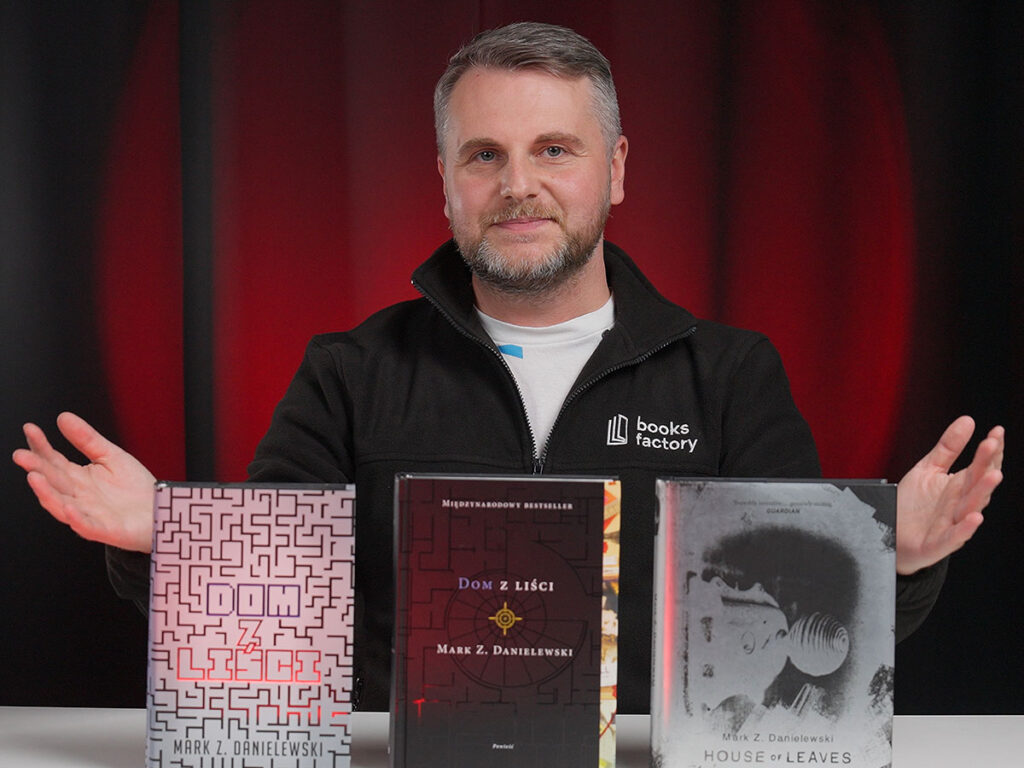
In the second episode of Book Anatomy, we take apart three editions of “House of Leaves”: the British one from Doubleday (2024) and two Polish ones, from MAG (2016) and Znak (2024). We are not judging the plot. What interests us is how each of these editions was designed as an object, and what the construction of this book demands of the publisher and the printer.
A novel that has to be typeset from scratch in every language
Photojournalist Will Navidson moves with his family into a house that is bigger on the inside than on the outside. An old man records the history of this house on loose sheets of paper. After his death, someone else entirely surrounds it with footnotes of his own: Johnny Truant. Three voices, three layers of narrative, hundreds of cross-references.
In a typical book, text flows down the column, paragraph after paragraph. If a translation turns out longer than the original, it simply spills onto the following pages. The book grows by a signature, and the reader notices nothing. With Danielewski, that doesn’t work, because the page is a composition, not a container. A single word sits in a particular corner, and a text box has to stay exactly where it is. A footnote runs across the margin or upside down, and a blank page is blank on purpose and must not be filled. Every such space has to be rebuilt from scratch in every language. In practice, typesetting like this is typographic translation.
Colour that changes the economics of a print run
On top of the layout comes the ink. The word “house” is blue every single time it appears in the novel, even when it hides inside another word. “Minotaur” and long struck-through passages are, with one small exception, red. The colour carries meaning, so it cannot be treated as decoration.
That has an immediate effect on cost. In a typical book, colour appears on the cover and endpapers, sometimes on a separate insert. The text block is printed in a single black ink, because that is much cheaper than full CMYK. Danielewski cancelled out that saving: his colour is scattered across 700 pages. The publisher therefore has a choice—full CMYK in every signature, or giving up the game the author invites us to play.
Publishers have chosen differently, which is why several versions of the same novel have circulated: full-colour, two-colour, black-and-white, and an incomplete author’s draft. Each step down means a different cost threshold and a different degree of cutting back the design. In the black-and-white version, the signals fade out and the reader gets a text with part of its meaning switched off.
Interestingly, the publishers are open about it. The copyright page of all three copies discussed here carries a table of these variants, with a box around one of the columns showing which version you have just bought. It would be hard to find a more honest price list. All three editions we compare are full-colour versions.
Doubleday 2024: a title hidden in black
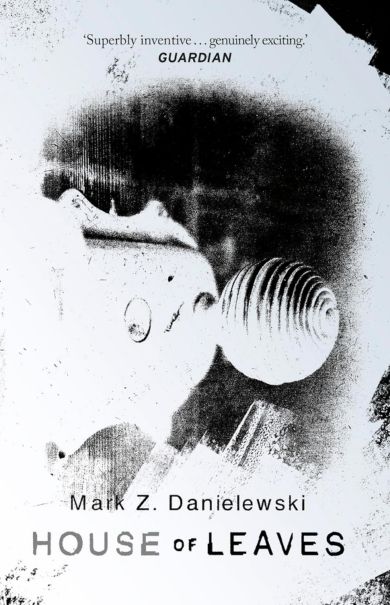
The British edition is the first hardcover of “House of Leaves” on the UK market. It appeared only 24 years after the book was first published. The imprint gives no credit for the person responsible for the typesetting.
The dust jacket combines black and silver on matt coated paper, printed on one side only. A small detail is easy to miss: the flaps have not been trimmed, so when the book is closed, they stick out slightly past the edge.
The real treat lies under the jacket. It is a black covering with a distinct cloth texture, bearing a floor plan and a spiral staircase. On the spine, the pattern runs in silver and is immediately visible. On the front cover, the effect is subtler. With my fingernail, I can feel a slight indentation, which suggests transparent foil stamping. Black foil on a black ground is also possible, in which case the whole effect comes from the difference in gloss. It cannot be settled with the naked eye, which, in a book about things hidden inside walls, seems perfect.
The spine completes the picture: “House” gleams in silver, while “of Leaves” disappears into black. The back cover carries the narrator’s opening lines, also stamped and readable only at an angle.
In binding terms, this is the best edition of the three. The boards are 3 mm thick, the text block is sewn and glued, and the spine is rounded. Backing is there, although it could be deeper and more even. It opens very well: the book lies flat and doesn’t try to close. On top of that, there is a black headband and a black ribbon marker, the only one among the three. Inside are the only endpapers in the comparison printed on both sides, with strings of hexadecimal code instead of ornament.
Format: 24 × 19 cm, 710 pages, a text block 4.5 cm thick. The paper is white and thin, and the print shows through to the other side in places. That is the price of keeping the thickness reasonable at such a large format.
MAG 2016: the labyrinth in plain sight
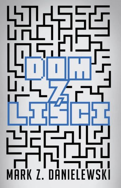
The second edition, translated by Wojciech Szypuła, is the only one in the comparison with a fully Polish design. The illustration is by Irek Konior, the graphic design by Piotr Chyliński, and the typography and layout by Tomek Laisar Fruń. His was the most thankless task: rebuilding the labyrinth from scratch in Polish.
The labyrinth doesn’t hide anywhere here. A silver-and-black pattern covers the entire dust jacket. At its centre, “Dom” (“House”) rises in an embossing with blue metallic foil, while “z liści” (“of Leaves”) sinks into the paper. Embossing and debossing side by side on one cover is a bold and consistent choice, and not even the untrimmed flaps undo it. Things get worse once you remove the jacket. Underneath is the same title composition, only without the labyrinth. Repetition instead of revelation.
In binding terms, it is a step down. The endpapers are white and unprinted. The boards are 2 mm thick, the text block is sewn and glued, and the spine is rounded. The backing, however, is noticeably shallower than in the British edition, so the book is less comfortable to open. White headband, no ribbon marker.
Format: 23 × 16.5 cm, 800 pages, a text block more than 5 cm thick. The paper is similar to that of the British edition and shows through just as much. This is the narrowest page and the largest page count in the comparison, which will prove crucial in a moment.
Znak 2024: back to the source
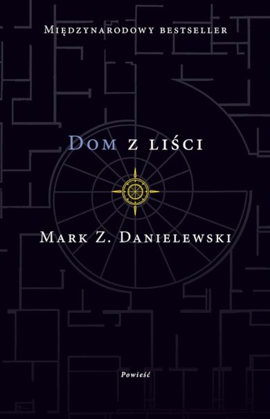
The same Szypuła translation, but a completely different visual strategy. The cover was designed by Eric Fuentecilla, who created the original American cover in 2000, and the Polish adaptation is by Karolina Korbut. Znak deliberately goes back to the source instead of looking for a language of its own.
There is no dust jacket at all. All the weight rests on a printed case wrap finished with UV varnish: a black floor plan, a spiral of stairs and, at its centre, a gold compass rose. Elegant and calm, though without a moment of discovery, because there is nothing here to take off.
The endpapers make up for it, the only colourful ones in the comparison. At the front, a collage of rulers, film strips, a compass and bloodstains; at the back, a drawing of a stairwell. The inner sides of the boards are black, with press quotes and a note about the author. A space that is often wasted on white is doing marketing work here.
The boards are 2 mm thick, as in the MAG edition, the text block is sewn and glued, and the spine is rounded more carefully. The backing still isn’t impressive, but the book opens noticeably better, almost as well as the British edition. Black headband, no ribbon marker.
The text block uses the best paper in the comparison: uncoated, slightly greyish, rough and cool to the touch, almost completely opaque. Format: 23.5 × 17 cm, 764 pages and only 4 cm thick. That makes the block thinner than the British one, despite 54 more pages.
Finally, my favourite detail. Strikethroughs serve a specific purpose in this novel: they mark passages that someone tried to delete, but which remained and can still be read. Znak carried this convention over to its own copyright page. The line “Wydanie pierwsze, Kraków 2024” (“First edition, Kraków 2024”) is crossed out in the same red that runs through the whole novel. The publisher signed off on the book in the novel’s own language.
The three editions in numbers
| Feature | Doubleday 2024 | MAG 2016 | Znak 2024 |
| Format | 24 × 19 cm | 23 × 16,5 cm | 23,5 × 17 cm |
| Page count | 710 | 800 | 764 |
| Block thickness | 4,5 cm | over 5 cm | 4 cm |
| Board thickness | 3 mm | 2 mm | 2 mm |
| The dust jacket | black and silver, matt coated paper | labyrinth, embossing and debossing | none |
| Endpapers | printed on both sides, hexadecimal code | white | colour |
| Headband / ribbon marker | black / black | white / none | black / none |
| Paper | white, thin, shows through | similar to the British edition, shows through | uncoated, greyish, almost opaque |
Page width: the heart of the matter
The British page is 19 cm wide; the Polish ones are 16.5 cm (MAG) and 17 cm (Znak). That is up to 2.5 cm of difference in a book where text runs into the margin, rotates and jumps into boxes. Doubleday bought this layout some breathing room. It paid with a format that sits awkwardly in the hand and won’t fit in a backpack.
The Polish publishers had a harder task. Polish takes up more space than English, and the pages cannot be rebuilt at will. MAG solved this with page count, reaching 800 pages with the narrowest column in the comparison. Znak fitted the same translation into 36 fewer pages because its page is half a centimetre wider. Paper with a lower bulk also gave it the thinnest block in the comparison. Across a whole print run, 36 pages mean less paper and real money.
Verdict and Book Anatomy Score
If I could keep only one edition on the shelf, I would take the British one. Not because it is the most beautiful, but because it is the only one that understands what this book is about and carries that into its design. A novel about things hidden inside walls hides its own title in black. The narrator’s quote becomes readable only at an angle, and the pattern on the covering stays on the edge of visibility. Instead of decorative endpapers, we get raw code. Here, form repeats the postmodern gesture of the content.
Znak comes out as the most sensible: the best paper, the most carefully made block, the most comfortable read and respect for the original instead of forcing a path of its own. MAG has the boldest Polish design, but it loses what Danielewski builds on: the difference between what is visible and what has to be uncovered.
In the Book Anatomy Score, we don’t rate the plot, or whether Johnny should finally get some sleep. We look only at the edition as an object:
- Doubleday 2024: 4.75 Books out of 5. The only edition in which the finishes say the same thing as the text. A quarter off for unpolished finishing details.
- Znak 2024: 4 Books. The best-made book in the comparison, except that without a dust jacket there is nothing to uncover.
- MAG 2016: 3.5 Books. The boldest Polish design, which stops exactly where the case covering begins.
And you? Which edition would you put on your shelf? If you own the two-colour or black-and-white version, tell me in the comments under the episode, because I would really love to see it.
Sources:
- „House of Leaves”, Doubleday 2024, ISBN 978-1-5299-4399-3
- “Dom z liści”, Wydawnictwo MAG 2016, translated by Wojciech Szypuła, ISBN 978-83-7480-657-2
- “Dom z liści”, Znak 2024, translated by Wojciech Szypuła, ISBN 978-83-240-9979-5