


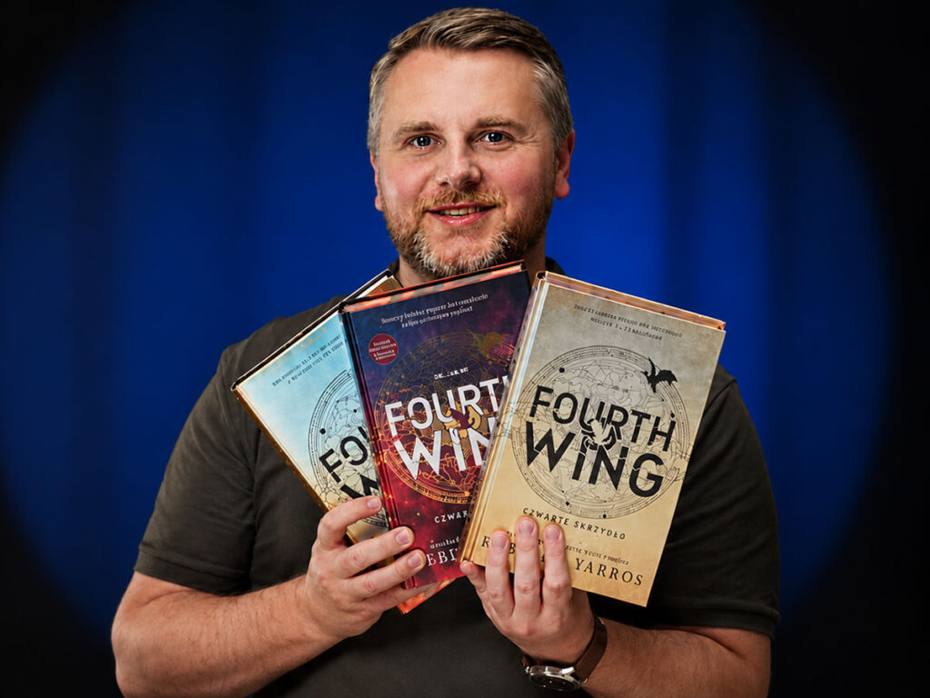
The same dragons, the same military academy, the same heroine. Three editions of Fourth Wing stand side by side and at first glance they do exactly the same thing: hardcover binding, a rounded spine, a sewn-and-glued text block, cream paper, gold and black, edge printing. And yet they do not repeat a single strategy. Each answers the same question differently: what should the physical edition of a global bestseller be?
That is why this title opens Book Anatomy, our series about books looked at as objects. We are not asking whether it is a good novel. We are asking how it was designed as an experience.
Form speaks first
Fourth Wing is one of the loudest titles in contemporary romantasy: a military academy, a brutal selection system, dragons, political tension, romance and a heroine dropped into a world more ready to break her than to take her in.
But before you read the first sentence, the book already promises something. The dragons work as a visual signature, not as decoration. Gold, black, red, ornaments, maps and printed block edges add up to a visual language that announces an epic, intense story, addressed to a community that reads and collects at the same time.
What BookTok did to the cover
A cover once had to sell the story. Today the whole edition works, viewed from every side: from the front, from the spine, from the edges, once opened, even lying closed on a table. Books like this circulate in unboxings, in recommendations, in shelf photos and in arguments about which edition has the better-looking edges.
That changes the hierarchy of design decisions. Edge printing is promoted from an add-on to the main carrier of emotion. Endpapers stop being a neutral structural element and start to tell a story. What counts is not only how beautiful the book is, but how photogenic it is from every angle. Seen in that light, the three editions of Fourth Wing become interesting.
The US edition: premium with a second layer
The edition from Red Tower Books makes the best first impression, though not because it shouts the loudest. On the contrary: it plays on elegance and understands best the tension between a book to read and a book to collect.
The first layer is the dust jacket: gold, with deep red and brown, with black typography and an ornament. It places the whole in the register of epic fantasy, but it adorns rather than overwhelms. The best part comes once you take it off. Underneath waits black cover material dyed through, with gold typography, a logo and a dragon.
A deliberate move. With its jacket the book gains two identities: one commercial, visible on the shelf straight away, and one more intimate, revealed only in your hands. It works like well-designed premium packaging, where part of the experience waits until you make the gesture.
There is systemic thinking here too. The colours from the jacket continue onto the block edges, so the edge printing does not look like a tacked-on effect but enters the same composition. That is rare. In many collector’s editions the printed edges land on the design like a sticker: attractive, but separate. Here they complete the whole instead of fighting it.
Inside, the type size is larger than in the Polish editions, and you can see it without measuring: the page breathes, reading goes more comfortably. No small matter, because with special editions it is easy to be dazzled by a metallic sheen and forget that the reader spends most of the time with the column of text, not with the cover. The paper is cream and pleasant, of a lower weight, which makes the whole thing sit well in the hand. Premium built on layers and comfort, not on weight.
One clear usability drawback: how it opens. The Polish editions open more pleasantly; here the spine works less well.
The first Polish hardcover: everything up front
The first Polish hardcover edition, from Wydawnictwo Filia, takes a different path. It gives up the dust jacket, so the moment of discovery disappears. You remove nothing to reach a second layer: the printed cover material carries the whole message from the start.
The cover is gold, metallic, with black text and brown shading along the bottom. A different kind of premium than across the ocean. The US edition tempts you with unveiling; the Polish one hits with instant effect. One glance and you have it all: hardcover, gold, dragons, edge printing. This edition does not hide its strengths, it puts them front and centre.
Most happens on the block edges: a solid black field with areas left in the colour of the paper, forming dragons along the long edge. Striking, but ungrateful in production. A large black surface on the edge immediately exposes the limits of saturation, and when the black lacks depth, the eye catches it. A pattern with more colour variation, as in the US version, forgives far more. A solid black field is conceptually tempting, but it also risks more.
Inside, the setting gets denser, because the type size went down. The page loses a little typographic comfort, but the book fits into an extent close to the original, despite the translation. A compact, controlled block instead of room for the eye. The paper looks like high-bulk cream stock, matte and slightly rough to the touch. The whole thing weighs more than the US version, so it feels completely different in the hand.
This is not a cheaper variation on the US edition, but a different strategy: less layered, more direct, at times on the edge of opulence. From the first glance it wants to look like a bold, collector’s edition of a popular title.
The Polish special edition: a book for the fandom
The Polish special edition, also from Filia, intrigues the most, because it shows what happens to a book when a title grows into a recognizable brand. It does not aim at someone who comes across it by chance in a bookshop, but at a reader who already knows what Fourth Wing is, or at least knows that a community has grown around it.
The cover stays metallic, but the tonality changes: gold gives way to red, black and white typography. The message shifts immediately. The first Polish edition played epic and dragon-heavy; the special edition plays drama and emotion. Red does a lot of the work here, acting as a genre signal: tension, relationship, danger. That is exactly how this story lives in circulation on BookTok.
The difference shows most strongly on the edges. Edge printing develops much further here: black, red, clouds, dragons, rays, a motif running consistently across every edge. No longer a graphic mark on one side of the block, but a scene viewed all the way around.
The decision about the endpapers is even more interesting. In the earlier editions the map plays the key role, a classic fantasy device that builds the world and orders its geography. The special edition swaps the map for illustrations, and that resets the function of the book’s beginning and end: instead of worldbuilding you get emotional contact with the characters and the dragons. Very telling for romantasy. Classic fantasy calls out: see how vast this world is. Romantasy more often whispers: see who you want to live this story with.
Inside, the setting resembles the first Polish edition, the same typographic direction and similar paper, with a slightly larger extent. This is not a new book construction, but an existing product developed towards collecting. The special edition does not touch the function, it shifts the positioning.
Three definitions of value
Set side by side, these three books defend three different ideas of what the reader is paying for.
- The US version goes for layering and reading comfort: the dust jacket, black cover material underneath, coherent edge printing, the most comfortable type size. It does not have to shout from the shelf, because it makes up for it in contact with the reader.
- The first Polish hardcover plays on physical presence and an immediate premium effect. No discovery, but a strong signal on display: more than a standard hardcover.
- The Polish special edition goes for collectibility and belonging to the fandom: the boldest colour palette, the most spectacular edge printing, endpapers that move the emphasis from a map of the world to relationships with the characters.
The form also gives away where each of these books sits in the market. The American one looks like a project for a broader readership: it has collector’s features, but it still holds on to the reading function. The first Polish edition is a local answer to a global phenomenon, because the publisher knows that a hardcover alone is no longer enough, so it adds a metallic finish and edge printing, without yet entering the full layering of the experience. The special edition goes a step further, assuming that a book today goes not only to be read, but also into photos and Stories.
Which edition stays on the shelf
The Polish special edition catches the eye fastest. The red, the edge printing and the endpapers do exactly what they were designed to do, and the whole thing captures the character of Fourth Wing as contemporary romantasy most faithfully. It understands that for many readers this book means more than a fantasy adventure, because it grows into a reading identity.
If I had to leave one edition on the shelf, though, I would reach for the American one. Not for the greatest effect, but for the balance of three things: readability, layering and coherence of design. The jacket gives the first contact, the black cover material the moment of discovery, the edge printing closes the visual system, the larger type size supports reading. And the whole thing keeps excess in check. It is the most mature of the three strategies.
Because Fourth Wing is not intriguing for the dragons on its cover; you will find hundreds of books like that. It is intriguing because a single title shows how differently various markets read the physical book today. To one it is above all a well-designed bestseller. To another, a striking premium product. To a third, a collectible object for the fandom. And that is the most entertaining part of analysing books: what often prevails is not the content itself, but the way the object was designed to make us want to own it.
Book Anatomy Score
To finish, a score in which neither the plot nor the romance counts, only the edition as a physical object.
- The US version: 4.5 Books out of 5. For the layering, the dust jacket, the excellent black cover material underneath, the coherent match of colours with the edge printing and the most comfortable type size. Better opening is all it lacks to be ideal.
- The first Polish hardcover: 3.5 Books out of 5. For the strong visual effect, the solid physicality, the successful move into premium aesthetics and the bold edge printing. Points off for the lack of a jacket and of a second layer to discover, and for the solid black field, which is hard to keep at perfect saturation.
- The Polish special edition: 4 Books out of 5. For the best feel for the fandom character of this book, the most spectacular edge printing, the bold colour palette and the smart move with the endpapers. Less subtlety here, but the edition knows perfectly well what it wants to be.
Your turn
The full episode, with close-ups of the edges, the endpapers and the typesetting, is on our channel. Which of these three editions would you put on your shelf: the American one, the first Polish one or the Polish special edition? Or another one, from a different market? Tell us in the comments under the episode, and suggest titles we should take apart in the next instalments of Book Anatomy.