


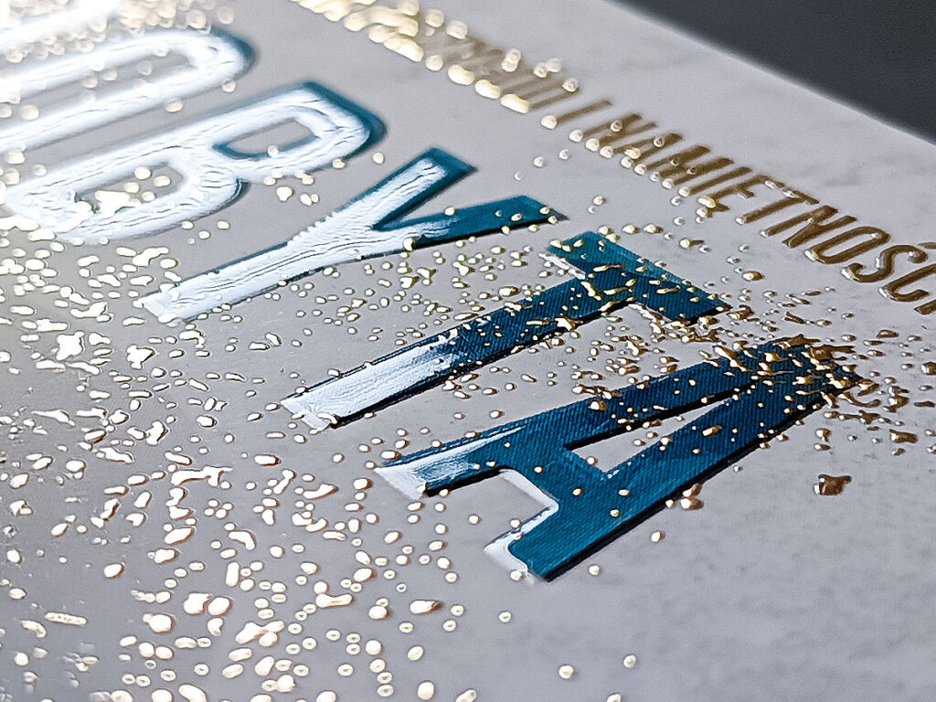
Some covers make you want to touch them before you’ve even read the book’s description. At first glance they look elegant, but only when they catch the light do they reveal their strongest effect: a glossy title, a subtly highlighted pattern, a shimmering author’s name, or a detail that stands out from a matte background. This is the moment when paper stops being just a carrier of content and starts building an impression of quality. Spot varnish is very often responsible for this effect.
In this article, we’ll explain what spot varnishing is, when it’s worth using, and why it works so well in cover designs, promotional materials, and packaging.
What exactly is spot varnish?
Spot varnish is a type of print refinement that involves applying a layer of varnish only to selected parts of a design. It can be flat or raised, and it doesn’t cover the entire surface — only specific spots: a title, a logo, a graphic, an ornament, a photo, a pattern, an illustration element, or a detail of the composition.
The easiest way to picture this is on a book cover. The background can be matte, calm and slightly muted, while the title itself is glossy and more noticeable to the touch. This way, the reader’s attention is immediately drawn to the most important part. The cover doesn’t need extra decoration, because the light itself brings out the planned accent.
The effect depends on the design and the type of varnish. Most often we see a gloss that beautifully contrasts with matte foil. However, a more three-dimensional, raised, or tactile effect is also possible. It all depends on the technique, the thickness of the layer, and how the varnish is combined with the other finish elements.
It’s worth stating right away: spot varnish is not meant to rescue a weak design. If the composition is chaotic, poorly prepared, or overloaded, the gloss won’t solve the problem. A well-used varnish highlights what has already been thought through. It works like a spotlight on a stage — it doesn’t create the show by itself, but it directs the eye where it needs to go.
How does spot varnishing work?
Spot varnishing involves precisely applying varnish to specific parts of the print. In the design, you need to indicate which parts should be varnished. A separate mask is needed to apply the varnish. Mark the elements to be varnished in black (100% K), and leave the rest of the page white (0%). The mask must be binary — no gradients, shadows, or transparency; the varnish is either there or it isn’t.
If we want only the title to shine, the varnish is applied to the title alone. If we want a pattern that’s visible only at an angle, the mask covers that pattern. If the gloss is meant to appear on raindrops, stars, a character’s eyes, or a fragment of an illustration, this needs to be planned already at the file preparation stage.
Precision matters a great deal. The varnish should land exactly on the chosen spot. With small letters, thin lines, or very fine details, caution is needed, because an element that’s too delicate might not produce a readable effect. That’s why slightly larger surfaces, clear shapes, titles, graphic marks, and motifs with enough room for the varnish to work tend to perform best.
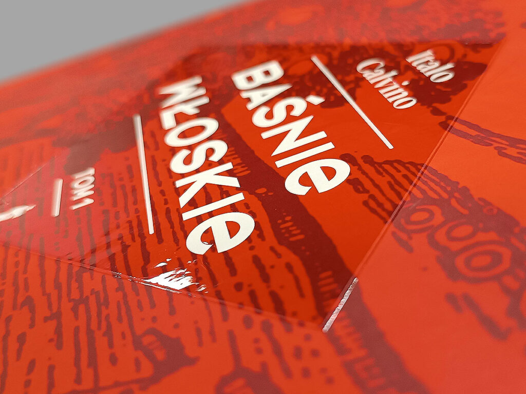
In book printing, spot varnish is often combined with matte foil. This combination creates a very elegant contrast: a calm, satin surface with glossy accents that appear only when the cover catches the light. The effect doesn’t look flashy, but it immediately suggests a more carefully made edition.
Spot UV varnish — what makes it different?
At Books Factory, we offer spot UV varnish. The name comes from the way the varnish is cured — once applied, it’s hardened with UV radiation. This makes the surface durable, glossy, and more resistant to abrasion than a regular print.
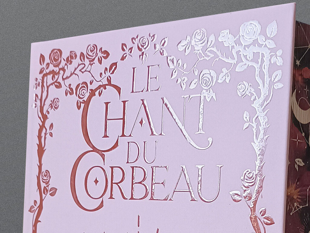
Spot UV varnish gives a strong, distinct shine. It looks best on a matte background, where the contrast becomes most visible. A glossy title on a matte cover, a shimmering pattern on a dark background, or a subtly highlighted illustration element can clearly change how a design is perceived.
This type of refinement works especially well wherever you want to convey a sense of elegance, depth, or stronger emphasis on a specific element. That doesn’t mean it suits every publication, though. For very minimalist, raw designs, plain matte lamination is sometimes enough. For more representative, gift, or sales-oriented projects, UV varnish can noticeably boost the appeal of the edition.
Where is spot varnish used?
The question where spot varnish is used comes up often, because this refinement is mainly associated with book covers. Indeed, it’s very popular in the publishing industry, but its use is much broader.
Spot varnish can be found on catalogues, folders, invitations, gift cards, presentation folders, packaging, business cards, calendars, promotional materials, and albums. In each of these cases it serves a similar function: it highlights selected elements and reinforces the impression of careful craftsmanship.
Publishers like to apply varnish to titles, authors’ names, series marks, illustration fragments, or decorative patterns. Brands use it to emphasize a logo, a slogan, a product, or a packaging detail. In premium materials, the varnish can work very subtly — sometimes it’s only visible once the page is tilted. In sales materials, it tends to be bolder, since it needs to grab attention immediately.
What matters most is matching the effect to the project’s purpose. On an elegant album, the varnish might highlight only the title. On a children’s book, it can bring out stars, drops, magical elements, or selected characters. On a guidebook, it can accentuate a strong graphic mark. On a poetry collection, a single glossy detail is enough — one that doesn’t disturb the quiet of the design.
Spot varnish on book covers
Spot varnish on book covers works especially well, because the cover is the reader’s first physical contact with the publication. When a book sits on a shelf, in a package, arrives at a bookshop, or appears in a photo on social media, its look shapes the perception of the entire edition.
The varnish can highlight the title, the author’s name, an important part of the illustration, a symbol connected to the content, or a decorative pattern. In a thriller, it might bring out a trace, a blade, a raindrop, or a fragment of typography. In a romance — light, an ornament, a detail of a dress, a letter, or a floral motif. In a fantasy book — a sign, a map, stars, runes, or a magic symbol. In a guidebook — a title, an icon, a geometric pattern, or a series logo.
A well-planned varnish helps organise the cover. It doesn’t just decorate — it points to the most important elements. If the title shines, the eye goes to the title. If the gloss appears on a chosen illustration detail, the reader may feel that the design has a second layer. It’s a small thing, but details like this often decide whether a book looks ordinary or stays in memory.
With covers, durability matters too. A book gets picked up, turned over, packed, shipped, and placed on shelves. The refinement should therefore not only look good, but also be properly matched to the paper, the foil, and how the book will be used. That’s why the decision about varnish is best made before the graphic design is finalised — not only after the files have been prepared.
Using spot varnish in printed projects
Using spot varnish is worth considering when a project needs a more refined character, without an overly decorative effect. It’s a good solution for materials meant to be viewed up close and touched: covers, invitations, packaging, catalogues, or company materials.
Varnish can serve several functions. First, it draws attention — a gleam appearing under the light immediately catches the eye. Second, it builds contrast, especially combined with a matte background. Third, it adds a sense of depth, because the chosen element looks as if it’s raised. Fourth, it strengthens the perception of quality, especially when everything is well printed and properly finished.
However, you shouldn’t varnish everything that seems important. If the gloss appears on too many parts, it loses its meaning. The viewer won’t know where to look. It’s better to choose one or two accents and let them stand out. In refinements, restraint often wins.
For book projects, a good direction is varnishing the title, a chosen graphic motif, or a background pattern. For company materials — the logo, the slogan, or a visual identity detail. For packaging — the product name, the brand mark, or an element meant to be remembered.
Advantages of spot varnish
The advantages of spot varnish show up both in aesthetics and in how the whole product is perceived. The first is emphasis. A glossy detail stands out immediately against a matte background, so the design doesn’t look flat. Even a simple composition can gain depth if the varnish is used with intent.
The second advantage is elegance. Varnish doesn’t have to be loud. It can work very subtly, especially on a dark background or in the form of a delicate pattern. This solution often works well for gift books, albums, expert publications, and series that need to look consistent and carefully made.
The third advantage is a sense of higher quality. A reader may not know the name of the technology, but they’ll notice that the cover looks different from a standard print. The shine, the texture, and the play of light make the publication feel more refined.
The fourth advantage is the ability to guide the eye. Varnish lets you point to the most important element. In cover design, this matters a great deal, because readers often judge a book quickly: title, author, mood, genre. A well-placed accent helps them read the design without effort.
The fifth advantage is versatility. Varnish can be used across different genres and styles, from minimalist to richly illustrated. It all depends on how it’s used. The same effect can look luxurious, modern, magical, technical, or subtle — depending on the project.
When is spot varnish not the best choice?
Although varnish can genuinely boost a project’s appeal, it isn’t always needed. If a cover has a very raw, natural character, the gloss might disrupt its tone. For designs built on decorative papers, a strong texture, or calm typography, a simpler finish is sometimes the better choice.
Varnish also doesn’t work well on very fine details. Very thin lines, small letters, or intricate patterns may not produce the expected effect. Instead of an elegant shine, you’d get an accent that’s hard to notice or a technically risky element.
Costs also need to be kept in mind. Refinement raises production costs, so it should be justified. For low print runs, simple informational materials, or projects meant to stay as economical as possible, it’s worth calculating whether the effect is worth the extra cost.
That doesn’t mean varnish has to be reserved only for expensive publications. It simply means it should be a conscious decision. It works best when there’s something specific to highlight.
How to prepare a project for spot varnish?
A separate mask is needed, in PDF format. Mark the elements to be varnished in black (100% K), and leave the background white (0%). The mask should be vector-based — if you’re working with a bitmap graphic, prepare it at a resolution of 600 DPI. Convert all text to outlines. The minimum thickness of an element that can receive varnish is 0.5 mm.
Varnish shouldn’t be placed on random fragments. You need to check beforehand whether a given element has the right size, whether it keeps an adequate safety margin from the edge, the spine, and the trim line (refinements require larger margins than regular printing), and whether it doesn’t sit on scoring lines or the spine, where the varnish could crack. Printing always involves minimum tolerances, so very precise alignment of varnish to thin outlines can be risky.
Before you prepare your final files, check our technical specification or write to your account manager — we’ll help you figure out how to prepare the mask for a specific effect.
Spot varnish as a detail that changes how the whole thing is perceived
A well-used varnish works a bit like a pause in a sentence. It doesn’t say everything louder — it just holds the eye in the right place. It can highlight a title, bring out a symbol, add elegance, or make a cover memorable through touch and light.
That’s exactly why spot varnishing is so valued in projects that are meant to look more careful than a standard print. It’s not just about the shine. It’s about consciously pointing to what matters in the design.
If a book is meant to stand out on the shelf, look good in online sales, and give readers a sense of a well-crafted edition, spot varnish on book covers can be a very fitting choice — as long as it’s used with restraint, planned from the start, and prepared according to print requirements.
Want to see what spot varnish looks like in person — how it catches the light and changes the texture of a cover? Order your Sample Books and feel the effect for yourself.