


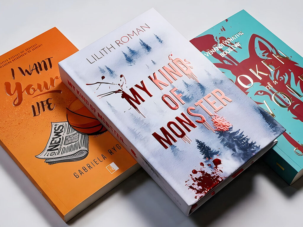
Book cover finishes can noticeably change how a publication is perceived. They can add elegance, increase durability, highlight part of the artwork or make a book more memorable. They do, however, need to be chosen wisely. Too many effects at once can weaken a design instead of strengthening it.
In this article, we look at the most popular types of cover finishes, how lamination differs from varnish, when special effects are worth considering and which finish to choose to match the character of your book.
What are cover finishes?
Cover finishes are additional techniques applied after printing. Their purpose is to improve the look, feel or durability of the cover, or the way it reflects light. They can cover the entire surface, like laminating film, or only selected areas, like spot varnish.
Ideally, book cover finishing is planned at the design stage. The designer needs to know whether the background will be matt or glossy, whether varnish will appear on the lettering, whether the corners will be rounded, and whether the design will include embossing, gold foiling or another effect. Contrast, margins, line weights, colour choice and layout all depend on it.
Cover lamination: protection and visual effect
One of the most widely used options is lamination, also known as film laminating. It involves applying a thin layer of film to the cover, which protects the surface and changes its appearance. As a result, the cover is less prone to dirt, moisture, scuffing and minor damage during use.
Lamination can involve different types of film, but the two options most often compared are matt and gloss.
Matt lamination gives a calm, elegant finish. It reflects less light, so it works well for minimalist covers, literary fiction, reportage, expert guides, albums with a subdued character and publications meant to look more understated. Bear in mind, however, that a matt surface can be more prone to visible scuffs, fingerprints or light scratches, especially on dark covers. At Books Factory, our standard lamination uses film with enhanced scratch resistance—both matt and gloss.
Gloss lamination does the opposite. It makes colours pop, increases contrast and reflects more light. It can make an illustration look more saturated and a photo more vivid. It suits children’s books, cookbooks, lifestyle guides, comics, catalogues, product albums and covers that need to be energetic or highly visible. Gloss does, however, come at an aesthetic price. On some designs it can look too intense, especially when the cover is meant to create a mood of calm, elegance or suspense. A highly reflective surface also makes the cover harder to see under bright light. So gloss lamination should not be chosen just because it “shines more”. It should match the tone of the publication.
UV varnish, spot varnish and selectively highlighting details
Alongside film, varnishes are a very popular option. They usually come up when you want to highlight a specific part of the cover rather than the whole surface. Spot (selective) varnish is UV varnish applied only to selected elements of the cover—either flat, which adds gloss, or raised (3D), which you can feel under your fingertips.
UV varnish is cured with ultraviolet light. It gives a striking gloss, can increase surface resistance and creates a strong contrast, especially against a matt background. If the cover has matt lamination and the title is finished with gloss varnish, the eye is automatically drawn to that element.
Spot UV varnish can be applied to the title, the author’s name, a series logo, part of an illustration, a pattern, a symbol, raindrops, stars, ornaments or other details.
Not every element is suitable for varnishing. Very thin lines, small lettering and intricate patterns can be difficult to reproduce or barely visible after printing. Also remember that varnish requires a separate mask in the production file. If it is to look good, it has to be planned while the design is being prepared, not added at the last minute.
Special effects on a book cover
The term special effects on a book cover covers several techniques that can give a publication a more distinctive look. They include embossing, metallic foil (digital hot stamping), flat or raised, e.g. gold or silver foiling, raised (3D) varnish, soft touch lamination, a die-cut window in the cover and, of course, rounded corners.
Classic embossing (with a die) involves pressing a chosen design into the cover surface using a specially made die. It can be blind, i.e. without foil, creating a raised or recessed relief, or combined with metallic foil, e.g. gold or silver. This technique lets you highlight a title, monogram, publisher’s mark or part of an illustration, giving it a texture you can feel under your fingertips.
Digital finishes (no die) achieve similarly striking effects without the need to make a die. Digital hot stamping applies metallic foil in a flat or raised (3D) version. Spot varnish, also available in flat and raised versions, highlights selected details with gloss or extra texture. Both techniques offer wide decorative possibilities, especially when you want specific elements of the cover to stand out.
The choice of technology depends, among other things, on the print run. Classic embossing requires a die, which means a fixed cost that is easier to spread over a larger number of copies. Digital finishes do not need a die, so they can be more cost-effective for shorter runs. The final choice should, however, also take into account the desired visual effect and the character of the project.
Soft touch lamination gives a velvety finish that is pleasant to the touch. It is often associated with premium publications, albums, gift books and projects meant to invite physical contact. Its main advantage is its very pleasant texture, but it is worth asking about its resistance to dirt and fingerprints, especially on dark covers.
Rounded corners are less spectacular than gold foiling or varnish. You can round the corners of the cover alone or of the entire block. They can noticeably change the character of a publication, making a book look softer, more practical or more gift-like. They work well for notebooks, planners, children’s books, guides, educational cards and publications that will be handled frequently. They are used less often on classic novels, as they may not fit the standard look of a book.
Beyond the cover: book edge printing
A special effect does not have to end with the cover. Book edge printing lets you decorate the edges of the block with a continuous motif, pattern or illustration. The artwork can echo the cover, extend it or form a separate composition. This option works particularly well for collector’s, limited and gift editions. It can also be used for series, with artwork that links several volumes.
At Books Factory, edge printing is done with CMYK pigment inks, on both softcover and hardcover books. You do, however, need to bear technological limitations in mind. We do not recommend covering entire edges with a solid colour, and ink may seep slightly between the pages. That is why edge printing is best planned while designing the cover, with the production files prepared accordingly.
Look, durability and cost: what should you compare?
When choosing a finish, it is worth looking at three things: aesthetics, durability and budget. Each technique has a different impact on the design and a different production cost.
Laminating film usually serves both a protective and an aesthetic purpose. Matt gives a calmer finish, gloss makes colours pop. Both protect the cover, though they behave differently in use. For books that will be handled, carried or shipped frequently, lamination is usually a sensible choice.
Spot varnish does more for the visual effect. It is not needed on every cover, but it can add character and help the title stand out. Its cost depends on the technology, the print run, the size of the varnished area and production requirements.
Embossing, gold foiling and special foils usually raise costs more than standard lamination. They also create a more striking effect, so it is worth reserving them for projects where they are justified: gift editions, albums, premium publications, limited runs, elegant series or books whose cover is a key part of what sells them.
The most expensive option is not always the best. Sometimes matt lamination and a well-designed title are enough. Sometimes it is spot varnish that brings out what the designer intended. And sometimes a book really does benefit from gold foiling, because its subject, audience and the character of the edition call for it.
Which finish should you choose for your type of publication?
The finish is best chosen with the book’s genre, design and sales channel in mind.
Literary fiction is often well served by matt lamination combined with subtle spot varnish, discreet embossing or restrained gold foiling. Such books rarely need a loud finish. Mood, good typography and a refined detail work better.
For crime novels, thrillers and action fiction, the contrast between matt and gloss works very well. A dark background, matt lamination and a glossy title can build suspense without overdoing it. UV varnish on a trace, a symbol or part of the artwork can add a second layer to the cover.
Children’s and young adult books more often call for bolder colours, gloss lamination, varnish on illustration elements or rounded corners. Energy, durability and a pleasant tactile experience matter here. Care is needed, though, to keep the effect from becoming chaotic.
Guides, business books and expert publications suit clean solutions: matt lamination, soft touch, spot varnish on the title or a simple graphic mark. The cover should inspire trust, not look like a brochure with random effects.
For albums, gift publications and limited editions, you can consider more striking techniques: embossing, hot stamping, raised varnish or a combination of a matt surface with a glossy accent. In such cases, readers often expect not only the content but also the pleasure of handling the object.
Technical points to keep in mind before printing
Finishes need to be planned before the files are sent to the printer. This is one of the most important rules. Each technique may require a separate layer, mask or production file, or specific distances from the edges.
For lamination, you need to take into account the cover size, bleed, scoring, spine, flaps (if any) and paper type. Spot varnish and metallic foil require a separate mask: black (K) areas tell the machine where to apply the finish, and each mask is saved as a separate, clearly named PDF. For embossing or gold foiling, you need to check the minimum line weight, font size, registration tolerance and technological limitations.
Not every effect works on every paper. Not every small graphic will take varnish well. Not every font will remain legible after foiling. A dark cover with matt lamination shows fingerprints more easily—worth bearing in mind for books that will be handled often. That is why, before final approval of the design, it is worth asking the printer for a technical specification and checking that the planned finish is safe for production.
It is also good practice to make a proof print or at least have the files checked. On screen, it is hard to judge gloss, texture, colour depth and light reflection. Print always adds a physical dimension to a design that a PDF preview cannot show.
Is it worth combining several finishes?
Different techniques can be combined, but it should be done with care. Matt lamination with spot UV varnish is a very popular and safe combination. Soft touch with varnish can also create a strong tactile and visual contrast. Embossing with gold foiling can look elegant if the design is simple and well prepared.
It is best to choose one dominant effect and possibly one supporting effect. If the title matters most, you can highlight it with varnish. If the book is meant to be a gift, consider gold foiling. If you care about durability and a calm look, good lamination is enough. If the publication will be used often, think about surface resistance, not just the visual effect.
Ultimately, a successful finish is defined not by the number of techniques used, but by how well they suit the design and the character of the publication. Well-chosen finishes emphasise the most important elements of the cover instead of distracting from them. So be guided not only by the appeal of individual effects but, above all, by how they will work together and the impression the finished book should make.
FAQ: frequently asked questions
What is the difference between lamination and varnishing?
Lamination involves applying a thin layer of film to the cover, which changes its appearance and protects the surface against dirt and minor damage. Varnishing, on the other hand, creates a specific visual effect, such as gloss on selected elements. Spot varnish can highlight the title, part of an illustration or another detail, and in its raised (3D) version it also adds a texture you can feel.
Matt or gloss lamination: which should you choose?
Matt lamination works well when you want a subdued, elegant look and fewer reflections. Gloss brings out colours and contrast more strongly, so it suits publications with bold illustrations or photographs. Keep in mind, though, that fingerprints and scuffs may be more visible on a matt surface, especially a dark one. The choice should therefore depend on both the graphic design and how the book will be used.
How do you prepare a finishing mask file?
For selective effects such as spot UV varnish, you need to prepare a separate mask showing where the finish will be applied. It is usually created as an additional layer or a separate file in which the selected elements are marked in solid black (K). The mask must match their position on the cover exactly. Before preparing the files, check the printer’s requirements for minimum line weight, detail size and how finishing areas should be marked.
Does every finish make a cover more durable?
No. Some techniques are mainly decorative. Lamination helps protect the cover surface against dirt, moisture and scuffing, whereas gold foiling, embossing or spot varnish mainly serve to highlight selected design elements. If a book will be used frequently, make sure the cover is properly protected first, and only then choose additional visual effects.