


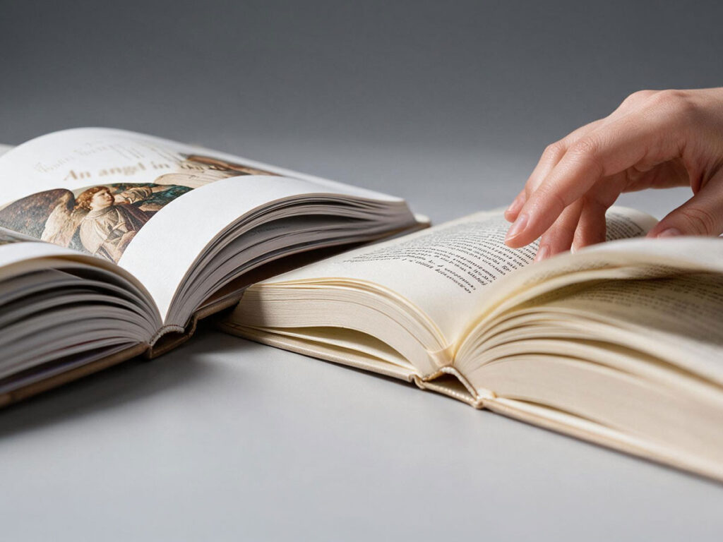
We judge a book with more than our eyes. We feel its weight, run a finger across the page, check whether the pages turn well and whether the print shows through to the other side. Paper works all the time, although we usually notice it only when it has been chosen badly.
Paper that is too thin may show through. Paper that is too thick adds needless weight to the publication. A smooth, white sheet will display photographs well, but in a long novel it can tire the eyes. Volume paper gives a book bulk, yet it will not always cope with illustrations full of fine detail. That is exactly why the paper weight for a book should never be chosen according to a single rule. A novel read over a dozen or more hours has different needs from a photo album, and a textbook carried in a backpack every day has different needs again.
In this article we will show you how to combine grammage, thickness, opacity and weight so that the paper suits the content.
Grammage describes the mass of a square metre, not the thickness of the paper
Paper grammage defines the mass of one square metre of the sheet. A sheet of the same size at 80 g/m² therefore weighs less than one at 120 g/m². The parameter helps you compare materials, but it does not answer every question about the printing that follows.
Two papers with the same grammage can be completely different. One will be thin, smooth and heavily compressed. The other will turn out softer, bulkier and noticeably thicker. Both weigh the same per square metre, yet once the same book is printed they will produce spines of different thickness.
So treat the figure given in g/m² as a starting point, not a finished answer. When making your choice, also check:
- the thickness of the sheet,
- the degree of bulk,
- the opacity,
- the surface texture,
- the shade of the paper,
- the stiffness,
- how the ink or toner behaves after printing.
Only all these properties taken together will let you predict how the book will look, how much it will weigh and whether it will be comfortable to read.
Grammage versus sheet thickness — two different parameters that are easy to confuse
Higher grammage is often associated with thicker paper. This is not, however, a rule you can safely base an entire project on.
The thickness of a sheet describes its physical dimension. It is affected by the type of fibres, how tightly they are compressed, the production method and the bulk of the paper. A dense 90 g/m² paper can be thinner than a bulkier 70 g/m² one.
Across a few dozen pages the difference may seem slight. In a 400-page book, that is 200 sheets, every fraction of a millimetre works on the width of the spine. The thickness of the block is, put simply, the number of pages divided by 2 and multiplied by the thickness of a single sheet. Suddenly it turns out that a publication printed on seemingly light paper is noticeably thicker than expected.
This matters for more than appearance. It changes the way the book opens, its flexibility, the construction of the binding and sometimes the cost of production and shipping as well.
So before you order the whole print run, ask for detailed technical data or physical samples. Paper seen only in a table will not tell you as much as a few printed and folded pages.
Paper bulk, or volume without unnecessary weight
Bulk, also called volume, defines the ratio of the thickness of the paper to its grammage. The higher the volume, the thicker the sheet while its mass stays relatively low.
Papers of this kind work very well in text-driven books. They give a publication a pleasant thickness without turning it into a heavy block. Thanks to that, a long novel can have a wide spine and still sit well in the hand.
Bulk also helps with shorter books. A collection of short stories, a volume of essays or a slim novel can look too thin on dense paper. Volume paper (bulky paper with a volume above 1.3 cm³/g) improves the proportions without artificially increasing the page count.
For a novel you can choose, among others, Munken Print Cream v1.5 90 g/m² or Munken Print White v1.5 90 g/m². Munken has a more premium character, a pleasant surface and a bulk that looks good in works of fiction.
For long novels, a good choice may also be Ecco-book Cream v2.0 70 g/m² and Ecco-book White v2.0 70 g/m². The higher volume produces a thicker block at a lower grammage, so your book keeps its bulk without becoming needlessly heavy.
It will not always be the best choice, however. A more open structure can be weaker at rendering very fine detail, saturated colours and precise illustrations. If the publication is built on photographs or complex graphics, it is better to look towards paper with a smoother, denser surface.
Opacity decides reading comfort
Thin paper does not have to show through, and heavier paper does not have to be highly opaque. How much print is visible from the other side of the sheet is a question of opacity.
At low values the text on the reverse shows through the page you are reading. Show-through is the visibility of print from the other side of the sheet; strike-through means the ink physically soaking through to the reverse. The eye tries to separate two layers of print, which quickly becomes tiring, especially with small type, tight typesetting and heavily saturated blacks.
Good opacity matters in novels, textbooks, practical guides and every book printed on both sides. It lets you use lighter paper without losing legibility.
Remember, too, that the degree of show-through depends on the design. Large areas of black, full-page illustrations and heavily printed pages will be more visible on the reverse than plain text. Judge the paper together with the actual content of your book, not as a separate material.
How to match paper weight to a novel?
In a novel, good paper stays invisible — the reader should not notice it. The reader is meant to focus on the story, not to fight stiff pages, a sheet that reflects light or the weight of the book.
Uncoated papers with a grammage of around 60–90 g/m² are the most common choice. Lighter ones work well for long publications. Higher grammages can be considered for shorter books, though you still have to make sure the block does not become too stiff.
In literary fiction, cream paper or paper with a slightly off-white shade works well. It does not reflect light as strongly as bright white and gives the text a calmer background. It also suits the character of a novel, a work of reportage, an essay or a biography.
For a classic novel you can choose:
- Ecco-book Cream v2.0 70 g/m² — a light volume paper, suitable for long publications;
- Ecco-book White v2.0 70 g/m² — similar bulk in a white shade;
- Munken Print Cream v1.5 90 g/m² — a more premium paper in a cream shade that is pleasant to handle;
- Munken Print White v1.5 90 g/m² — the premium variant in a lighter shade;
- Uncoated 80 g/m² — a universal choice for text-driven books, especially when you want a dense, classic surface.
For a long book, choose volume paper if you want to keep an attractive spine width without adding excessive weight. The reader will feel the difference after a few dozen pages, especially when reading in bed, while travelling or holding the book in one hand.
Paper for a photo book has to show the image well
A photo album, an art book or an architectural publication makes different demands on paper. Here what counts is the depth of colour, the sharpness of detail, contrast and the way light works on the surface of the page.
Coated paper with a grammage of around 130–200 g/m² is used most often. A smooth surface reproduces photographs, fine lines and tonal transitions better. Higher grammage also gives greater stiffness, which in an album is usually felt as an advantage.
For an album you can consider Munken Print White v1.5 150 g/m² if you want an elegant, uncoated premium paper and a more natural character of reproduction. For publications that call for strong colour saturation and a high level of detail, a better fit is paper coated on both sides, gloss or matt, commonly known as art paper.
Weight, however, calls for caution. A large format, several hundred pages and paper at the upper end of the grammage range will give you a striking book that is also heavy and very thick at the spine — at that point the limit is no longer aesthetics but binding technology. Sometimes a slightly lower grammage combined with good print quality and adequate opacity gives a better result.
The finish matters too:
- paper coated on both sides in gloss boosts saturation and contrast, but reflects light more strongly;
- paper coated on both sides in matt looks calmer and more elegant, though it may slightly mute the colours;
- Munken Print White v1.5 150 g/m² delivers a more natural, uncoated effect and can suit art books well.
Before production starts, order a proof copy made on the target paper and in the chosen binding. A monitor will not show you how black behaves on a particular sheet, or whether the photographs keep the right depth.
Which paper to choose for a practical guide?
A practical guide often combines text, photographs, tables, boxes and illustrations. It therefore needs paper that is neither too thin nor excessively heavy.
For a mainly text-based guide, a good starting point is Uncoated 80 g/m². If the publication contains few photographs and should stay light, classic uncoated stock gives a legible surface and room for comfortable note-taking.
With more photographs, charts or colour instructions you can choose a heavier uncoated paper or a coated one. A coated surface shows colours and detail more accurately, while uncoated reflects less light and works better in a book meant above all for reading and writing in.
For mainly text-based publications 80–100 g/m² is usually enough. If the pages carry a lot of colour photographs, charts or step-by-step instructions, 100–130 g/m² is worth considering.
Think as well about how the reader will use your publication. A cookbook, an exercise manual or a book about crafts often lies open on a table. Paper that is too stiff can make the publication harder to keep open, particularly with a glued spine.
A psychology, business or educational book dominated by longer chapters, on the other hand, will feel at home on calmer uncoated paper. It is more pleasant to read from than smooth coated paper, which reflects light more strongly.
Paper for textbooks and educational books
A textbook is read more intensively than most books. It is opened repeatedly, carried around, marked, turned back and forth and used for many months. The paper has to withstand that kind of use without adding excessive weight.
Uncoated papers with a grammage of roughly 70 to 100 g/m² usually work best. Choose the lower end when the page count is high and text dominates. Higher grammage copes better with illustrations, tables and exercises that the user will write on.
With exercise books, pay attention to the surface as well. The paper should not be too slippery if the user is going to write answers with a pen or pencil. Check the opacity too, and how well strike-through from felt-tip pens to the reverse side is limited.
In educational books for children you can use heavier, more durable paper, especially if the publication contains a lot of colour illustrations. Even so, the weight of the whole block has to be counted. A solid book does not have to be heavy to the limit of comfort.
Paper density is not the same as grammage
The notion of paper density is sometimes used interchangeably with grammage, although it describes something else. Grammage refers to the mass of one square metre, while density relates mass to the volume of the material.
Paper of higher density will be denser and more heavily compressed. At the same grammage it can be thinner than paper with a looser structure. That is exactly why two 80 g/m² sheets can behave so differently in a book.
High density can be useful in publications where the width of the spine has to be limited. Lower density and greater bulk work where volume and the softness of the pages matter.
Density and bulk (volume) appear to be two ways of looking at the same parameter — volume is the inverse of density. What sets them apart from grammage is that they describe the relationship of mass to volume, that is the real thickness of the sheet.
The texture of the paper tells a story too
A smooth sheet suggests precision, modernity and high-quality reproduction. Paper with a perceptible texture gives a more natural, craft-like character. It can suit a volume of poetry, an art book or a publication devoted to handicraft beautifully.
Texture does affect print quality, however. On a strongly porous surface, small letters and thin lines can lose their sharpness. Photographs will be less vivid than on smooth paper.
Match the material both to the character of the book and to the actual content of the pages. Paper can reinforce the mood of your publication, but it should not make the text or the illustrations harder to take in.
The weight of a book matters more than it seems
When choosing paper it is easy to focus on a single sheet and forget about the whole print run. Yet a difference of a dozen or so grams per square metre, multiplied by the surface of all the sheets, starts to be clearly noticeable.
A heavier book:
- is less comfortable during long reading sessions,
- increases the cost of transporting the print run and shipping individual copies to readers,
- requires a sturdier binding,
- works less well as a travel or everyday publication.
That does not mean you should always choose the lightest paper. It is a matter of proportion. An album can be heavier, because it is looked at on a table. In a 700-page novel, weight has to be watched much more carefully.
With a larger print run, the mass of the paper also affects the logistics of the whole production. A few hundred copies on a heavier material means extra kilograms on the pallets, in the warehouse and in transport.
How to match paper weight without guessing?
Start with the type of publication, its extent and the way it will be used. Only then move on to specific grammages and paper names.
Before choosing, answer a few questions:
- Will the book mainly be read, looked at or written in?
- How many pages should it have?
- Will text, photography, illustration or a combination of several forms dominate?
- Should the publication be light and easy to handle?
- How wide should the spine be?
- Can the paper show through slightly?
- Will the reader write on the pages?
- Which binding will be used?
- Will the book be shipped as single copies?
- What should it feel like to the touch?
Finally, it is worth ordering a sample and making a test print (proof copy). Technical specifications help narrow the choice, but only a physical sheet shows the colour, the stiffness, the texture and the way the paper takes ink.
Which paper weight for which book — comparison table
| Type of publication | Most commonly chosen grammage | What to look for in the paper? |
| Novel | 60–90 g/m² | Lightness, good opacity, cream shade, bulk |
| Reportage and biography | 70–90 g/m² | Reading comfort, moderate thickness, calm surface |
| Text-based guide | 80–100 g/m² | Legibility, little show-through, comfortable opening |
| Guide with photographs | 100–130 g/m² | Smoothness, good colour reproduction, adequate stiffness |
| Textbook | 70–100 g/m² | Durability, low weight, opacity |
| Exercise book | 80–100 g/m² | Writability, limited ink strike-through |
| Photo album | 130–200 g/m² | Smooth surface, high image quality, stiffness |
| Paper for children’s books | 350 g/m2 | Board books. Durability, stiffness, good reproduction of illustrations |
The values given are a point of reference, not a rigid prescription. The final choice depends on the format, the number of pages, the binding and the printing technology — in digital printing it also matters whether a given paper is suited to ink or toner. You will find the current grammages and paper types in our calculators.
Good paper should not draw attention away from the book
The best-matched paper for printing a book does not try to play the leading role. It supports the content, the illustrations, the binding and the way the book is read. It adds lightness to a novel, lets an album show detail, and helps a textbook survive daily use.
Before you decide, order the Paper Guide Books Factory. The sample book lets you compare the available paper types, check their colour, texture, grammage, thickness and degree of opacity, and see how print looks on them.
That way you do not have to base your choice on technical parameters alone. You can judge the real appearance of the paper, its surface and how it feels as you turn the pages.